
WARNING - This site is for adults only!
This web site contains sexually explicit material:
Hi everyone,
I've got an early look at the new SpringBreakLife design to share. We're developing a brighter, more spacious look that captures a little of that feeling of getting away, with warm paper tones, aqua and orange accents, and bold serif headings.
The proposed pages take inspiration from an opening spread in a magazine. Collections have room to breathe, with prominent titles, grouped details and a clear contents-style list to help give the site a sense of order.
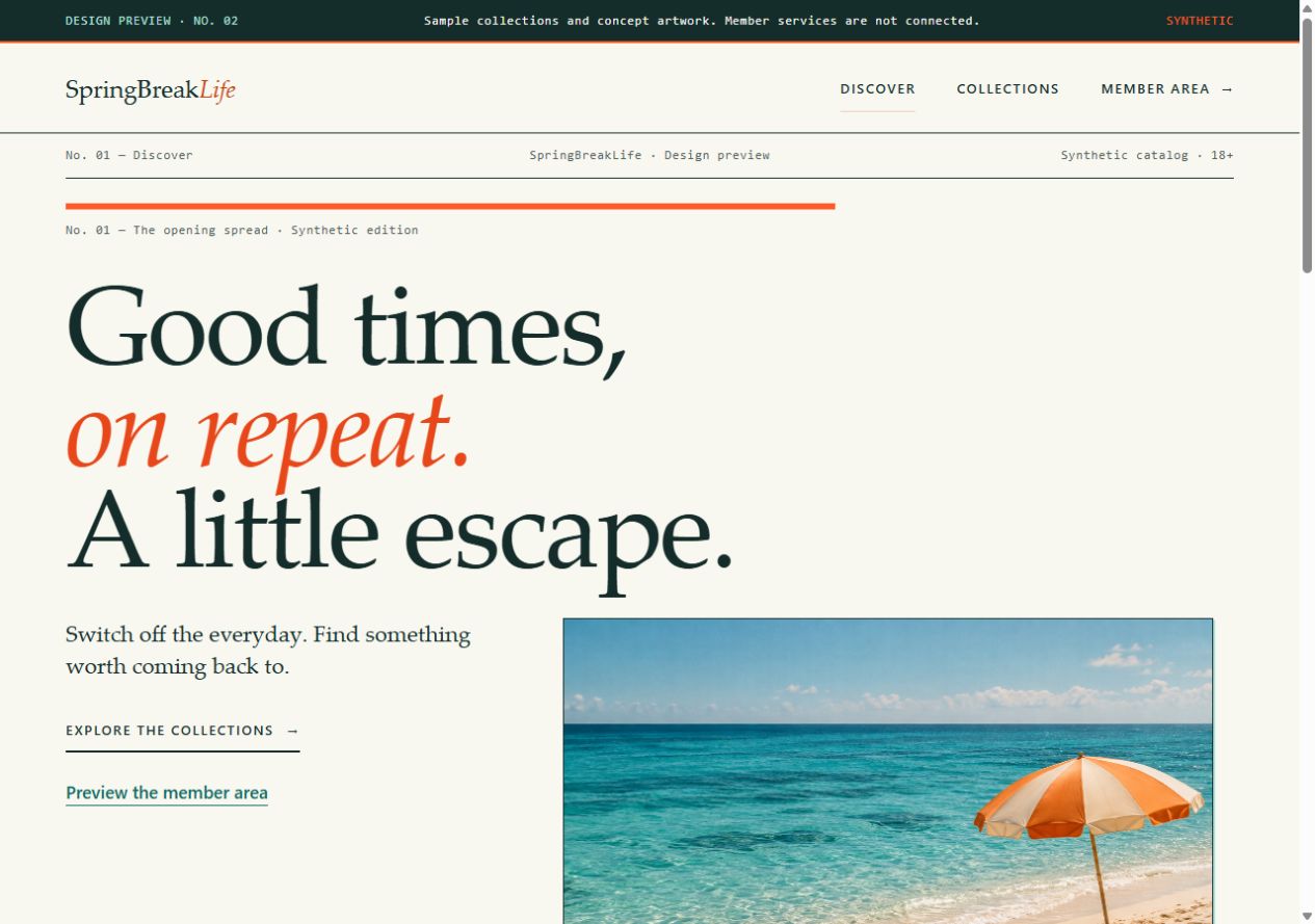
Work in progress: a preview of the proposed SpringBreakLife design. Sample content is illustrative; the final design and features may change.
Some of the design details we're developing:
The preview uses illustrative artwork and fictional sample collections. It shows the visual direction we're working toward, and the final design and features may change.
I wanted you to see the work taking shape before the new version arrives. Thanks for being part of SpringBreakLife, whether you've been visiting for years or have only just found the site.
Jim


